
We're net positive again in 2014!
We used 8,108 kWh and generated 8,348 kWh for a net of 240 kWh for the year. The combination of cold temperatures, less sun and the plug-in Prius brought us close to our net point. Here’s our progress for our first 3 years in the house.
| Usage | Solar PV | Net usage or (surplus) | Avg. daily usage | HDD | |
|---|---|---|---|---|---|
| Total | 20,914 | 25,779 | (4,864) | 19.1 | 19,758 |
| 2012 | 5,601 | 8,856 | (3,256) | 15.3 | 5,885 |
| 2013 | 7,206 | 8,575 | (1,368) | 19.7 | 6,810 |
| 2014 | 8,101 | 8,348 | (240) | 22.2 | 7,063 |
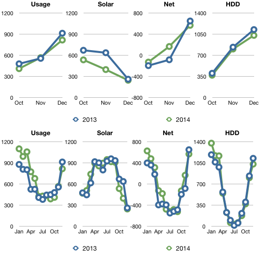
Q4 2014 summary: 7% warmer, 8% less usage and 25% less sun as compared to Q4 2013.
In Q4 last year our total usage was 1,957 kWh. This year is was 1,802 kWh, a 8% decrease. Snow covering the collectors for 8 days and cloudy weather resulted in 24% less energy production in Q4.
Overall, here’s how this quarter and the year compare to 2013.
| 2014 | Usage | Solar PV | Net usage or (surplus) | Avg. daily usage | HDD |
|---|---|---|---|---|---|
| Total | 1,802 | 1,186 | 616 | 19.6 | 2,213 |
| Oct | 413 | 538 | (125) | 13.3 | 373 |
| Nov | 570 | 400 | 170 | 19.0 | 807 |
| Dec | 819 | 248 | 571 | 26.7 | 1,033 |
| 2013 | Usage | Solar PV | Net usage or (surplus) | Avg. daily usage | HDD |
|---|---|---|---|---|---|
| Total | 1,957 | 1,576 | 380 | 21.3 | 2,372 |
| Oct | 482 | 674 | (192) | 15.6 | 405 |
| Nov | 559 | 639 | (81) | 18.6 | 838 |
| Dec | 916 | 263 | 653 | 29.5 | 1,129 |
Year over year comparison
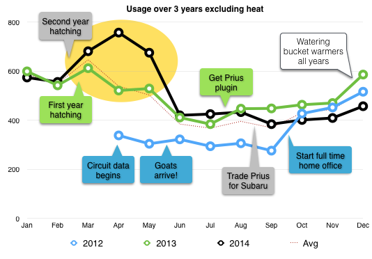
I like to compare the energy we use each year excluding heat. Our little story chart above, shows our usage and how it has played out over the last 3 years. By far our biggest energy increases have been related to hatching and brooding chickens and turkeys each spring. We managed to raise a year+ worth of chicken and turkeys this year, not to mention all the milk and cheese from the goats. It would of course be cheaper to buy chicken, eggs, milk and cheese, and Thanksgiving turkey at the store, but we like to do things the hard way.
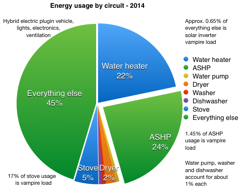
We started monitoring an additional 11 circuits in March when we switched to eGuage, but I haven’t had a chance to look at that data in any detail yet. The main changes this year, are increased usage of the ASHP and the ‘everything else’ category which included the Prius plugin for eight and a half months. I’ve also started tracking the vampire loads from things like the induction cooktop & stove, solar inverter and the ASHP. These are things you can’t just unplug. In total these 3 appliances used a minimum of 119 kWh to do nothing. I say minimum because I have only been able to start tracking some of these vampire loads with our new energy monitor starting in March.
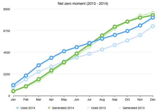
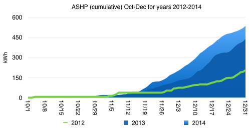
This year I started plotting when we net out on energy use versus production. I call it the ‘net zero moment’. This year it happened about 2 months later than last year. Thankfully we didn’t cross over again in December.
Last year I noticed that our air-source heat pump (ASHP) used a lot more energy (114% more) in 2013 than in 2012. 2013 was cooler than 2012 but it was also sunnier. I never figured out the increase. This year, the ASHP also used more energy than last year despite being 7% warmer. Both the lack of sun (25% less) and our change in use of the thermostat most likely had the biggest impact. In 2013 I turned the heat off at night. This was generally fine until we had a few days below zero and the heat pump was not able to make up the difference. So this year I tried leaving the unit on and just turning it down to 65F at night. I think this has increased our usage without any real gain in comfort. It seems like it’s really only important to keep the unit on if the next day’s temperatures are known to be below zero, which is where our ASHP has trouble keeping up with demand.
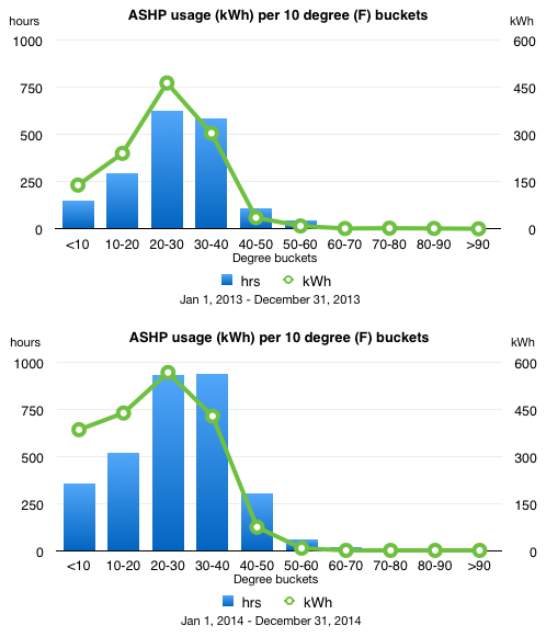
Speaking of ASHP usage, here is our plot showing the amount of energy we used for each 10 degree drop in temperature. If you remember the post from last year, 2013 looks a little different. I realized the ASHP vampire load was throwing off my count of hours. This year I only show hours where the unit was actually doing something, heating or cooling the house. We had substantially more hours below 50 degrees. Most of the ASHP usage has consistently occurred in the 20-30 degree range.
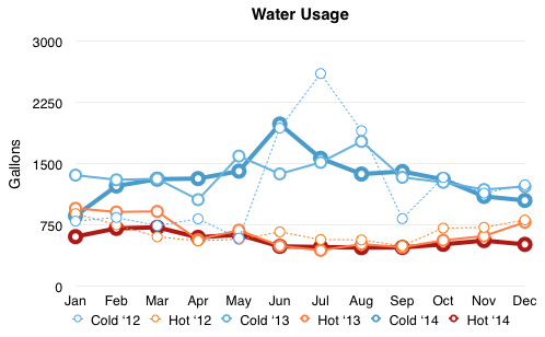
We seem to be fairly consistent in our hot water usage. Over the year we’re averaging 18.4 gallons/day. That hot water requires 262 watts/gallon to heat. Cold water usage averages at 43.5 gallons/day. In total we used 22,575 gallons on water in 2014. It took 58 kWh to pump that water out of the ground. I’m guessing half of that is water for the various assortment of critters on the farm. They don’t drink a lot, but they do waste a lot.
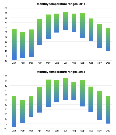
And lastly, just because I like this chart, the temperature ranges we experienced this year. In case it is not clear, 2014 was 0.9154149°F warmer on average than 2013.
Happy 2015!
You can see heat maps and detailed charts of temperature and electrical usage at netplusdesign.com. View hourly, daily and monthly values for solar, usage, net usage, temperatures and HDD.
Categories
- Air sealing 13
- Appliances & Fixtures 4
- Art 3
- Award 4
- Bathroom 8
- Batteries 1
- Decor 5
- Design 10
- Electrical 5
- Energy Calculations 13
- Energy Monitors 4
- Farm 1
- Finance 1
- Flooring 3
- Foundation 9
- Framing 8
- Heating 9
- House 7
- Insulation 8
- Kitchen 6
- Landscaping 3
- Lessons Learned 1
- Performance 60
- Plumbing 10
- Porch 5
- Radon 1
- Rainwater catchment 3
- Research / study 1
- Roof 7
- Septic / Waste water 2
- Sheetrock 6
- Siding 9
- Site Work 22
- Smart home 1
- Solar 64
- Solar Obsessed 10
- Stairs 2
- Surveying 3
- Ventilation 8
- Weather 1
- Windows & Doors 14
- plug-in 3
Archive
- Jan 2021 1
- Dec 2020 2
- May 2020 1
- Jan 2020 1
- May 2019 1
- Jan 2019 3
- Sep 2018 2
- Aug 2018 2
- Jan 2018 1
- Oct 2017 2
- Apr 2017 1
- Jan 2017 1
- Oct 2016 2
- Aug 2016 1
- Apr 2016 2
- Jan 2016 2
- Nov 2015 2
- Oct 2015 1
- Jul 2015 1
- May 2015 1
- Apr 2015 1
- Jan 2015 1
- Dec 2014 1
- Nov 2014 2
- Oct 2014 4
- Sep 2014 2
- Aug 2014 1
- Jul 2014 1
- Mar 2014 3
- Feb 2014 2
- Jan 2014 2
- Nov 2013 1
- Oct 2013 1
- Sep 2013 1
- Jul 2013 3
- Apr 2013 3
- Jan 2013 3
- Dec 2012 2
- Nov 2012 3
- Oct 2012 1
- Sep 2012 3
- Aug 2012 3
- Jul 2012 2
- Jun 2012 1
- May 2012 3
- Apr 2012 2
- Mar 2012 4
- Feb 2012 4
- Jan 2012 5
- Dec 2011 4
- Nov 2011 9
- Oct 2011 10
- Sep 2011 9
- Aug 2011 6
- Jul 2011 6
- Jun 2011 12
- May 2011 8
- Apr 2011 4
- Mar 2011 5
- Jan 2011 6
- Dec 2010 9
- Nov 2010 3
- Oct 2010 4
- Sep 2010 6
- Aug 2010 8
- Jul 2010 6
- Jun 2010 3
- May 2010 3
- Apr 2010 1
- Mar 2010 3
- Feb 2010 3
- Dec 2009 1
- Jun 2009 1
- May 2009 1
- Feb 2009 1
- Dec 2008 1
- Nov 2008 1
- Jun 2008 1