We're net positive again in 2015!
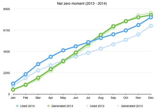
We used 7,141 kWh and generated 8,694 kWh for a net of 1,552 kWh for the year. This is our second highest net energy year after 2012. Here’s our progress for the first 4 years in the house.
| Usage | Solar PV | Net usage or (surplus) | Avg. daily usage | HDD | |
|---|---|---|---|---|---|
| Total | 28,056 | 34,473 | (6,417) | 19.1 | 26,530 |
| 2012 | 5,601 | 8,856 | (3,256) | 15.3 | 5,885 |
| 2013 | 7,206 | 8,575 | (1,368) | 19.7 | 6,810 |
| 2014 | 8,108 | 8,348 | (240) | 22.2 | 7,063 |
| 2015 | 7,141 | 8,694 | (1,552) | 19.6 | 6,772 |
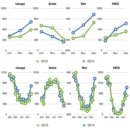
Q4 2015 summary: 18% warmer, 24% less usage and 42% more sun as compared to Q4 2014.
In Q4 our total usage was 1,802 kWh, an 8% decrease from our 1,957 kWh in 2014. We also generated 497 kWh more this quarter than last.
Overall, here’s how this quarter and the year compare to 2014.
| 2015 | Usage | Solar PV | Net usage or (surplus) | Avg. daily usage | HDD |
|---|---|---|---|---|---|
| Total | 1,367 | 1,683 | (315) | 14.9 | 1,810 |
| Oct | 377 | 710 | (333) | 12.2 | 488 |
| Nov | 399 | 648 | (248) | 13.3 | 597 |
| Dec | 591 | 325 | 266 | 19.1 | 725 |
| 2014 | Usage | Solar PV | Net usage or (surplus) | Avg. daily usage | HDD |
|---|---|---|---|---|---|
| Total | 1,802 | 1,186 | 616 | 19.6 | 2,213 |
| Oct | 413 | 538 | (125) | 13.3 | 373 |
| Nov | 570 | 400 | 170 | 19.0 | 807 |
| Dec | 819 | 248 | 571 | 26.7 | 1,033 |
Year-over-year comparison
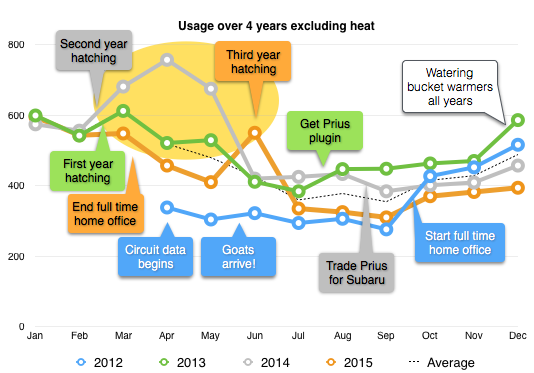
Our biggest energy months continue to be in Spring when we’re hatching and brooding chickens and turkeys. This is our second year to raise a year’s worth of chicken and turkeys. It is worth noting that I’ve been spending a lot more time outside the home office and the energy usage reflects this. Running a few computers, radio, etc every day adds up over a year. I think it’s interesting which months are very close (January-February), fairly close (October-November) and very divergent (April-June).
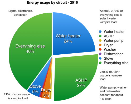
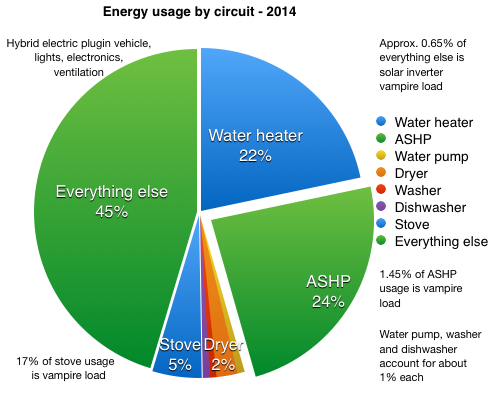
There’s not a lot of notable changes in usage by circuit (above). 2015 was both colder and hotter than prior years (see temperature ranges below). Because of the increased cold, the ASHP and water heater used a larger percentage of the total. Vampire loads increased this year because I forgot to flip the circuit breaker for the ASHP during the summer. The induction cooktop & stove and solar inverter both used about the same vampire loads as last year. In total these 3 appliances used 145 kWh in 2015 to do no useful work for us except be ready to leap into action at a moment’s notice.
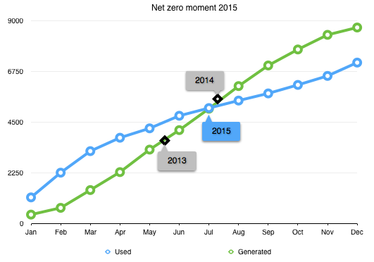
Our ‘net zero moment’ this year occured in early July. This was earlier than last year but much later than 2013. Our solar curve remains fairly constant. Our usage changes the most from year to year, manly due to weather.
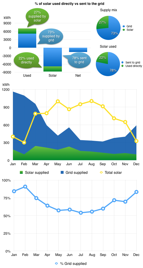
All that solar is awesome, but I’d really like to use more of it. Currently we only use 22% of the solar power we generate directly. The other 78% goes back to the grid so other people use it. That 22% represents 27% of our energy mix. 73% of the electricity we use is from the grid.
There are two ways to use more of our solar. 1) Only use power when the sun is shining. 2) Use a battery. Something like the Tesla PowerWall would do nicely.
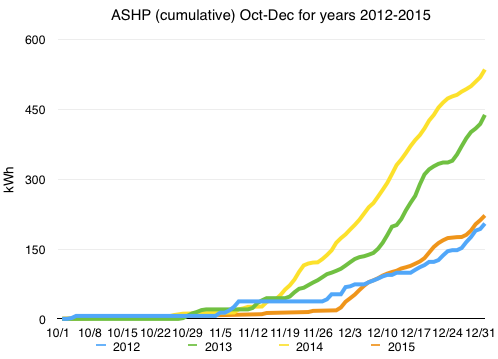
This was the warmest fourth quarter since we moved into the house. As a result, we used a lot less heating energy than the last two years. Every year I try a slightly different strategy with the thermostat. This year I programmed it at 65 during weekdays from 8am-4pm and 9pm-4am, and 68 at all other times. We generally get enough sun during the day that the daytime setback is not really noticeable. If we see a cold snap coming up I’ll reset it to stay at 68. I’m also trying to be more diligent and clean the filters every month. I think this may have played a part in our prior years increased usage, adjusted for weather.
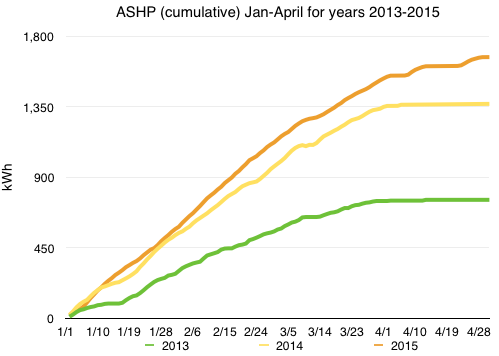
I also added a plot (above) of our heat energy usage in the January through April timeframe. It’s interesting because 2015 was colder than 2014 (4,541 vs. 4,274 HDD) but the heat energy was not that much greater (1366 kWh in 2014 vs. 1,665 kWh in 2015).
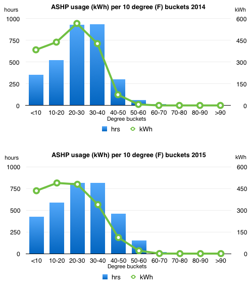
The plot above shows the amount of hours and energy we used for each 10 degree drop in temperature. 2014 had a larger number of hours in the 20-30 and 30-40 degree buckets. 2015 had less in these areas and more in the lower temperature bands. Most of the ASHP usage has consistently occurred in the 20-40 degree range.
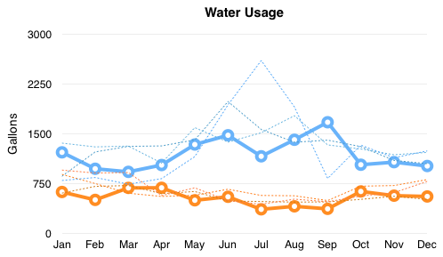
We seem to be fairly consistent in our hot water usage. Over the year we averaged 17.5 gallons/day, down from 18.4 last year. That hot water requires 263 watts/gallon to heat. We used 39.1 gallons of cold water per day, down from 43.5 last year. The difference is almost completely attributable to how much we water the garden. We used a total of 20,684 gallons of water in 2015, down from 22,575 last year. It took 52 kWh to pump that water out of the ground.
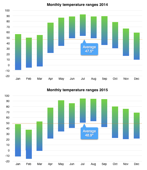
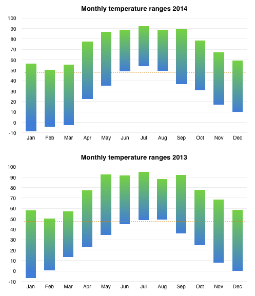
We experienced our largest temperature range this year out of the last 4 years, 110.721°. Our coldest temperature was -16.112° on February 16 at 7am. Our high was 94.609° on July 29 at 3pm. Our highest recorded temperature in the last four years was 95.135°, set on July 19, 2013 at 3pm.
The average temperature for 2013 was 48.5°. 2014 was 47.5° and 2015 was 48.9°. I’m missing January temperature data for 2012. At the end of this January I will be able to calculate the average for the last 4 years of our collected data.
Happy 2016!
Categories
- Air sealing 13
- Appliances & Fixtures 4
- Art 3
- Award 4
- Bathroom 8
- Batteries 1
- Decor 5
- Design 10
- Electrical 5
- Energy Calculations 13
- Energy Monitors 4
- Farm 1
- Finance 1
- Flooring 3
- Foundation 9
- Framing 8
- Heating 9
- House 7
- Insulation 8
- Kitchen 6
- Landscaping 3
- Lessons Learned 1
- Performance 60
- Plumbing 10
- Porch 5
- Radon 1
- Rainwater catchment 3
- Research / study 1
- Roof 7
- Septic / Waste water 2
- Sheetrock 6
- Siding 9
- Site Work 22
- Smart home 1
- Solar 64
- Solar Obsessed 10
- Stairs 2
- Surveying 3
- Ventilation 8
- Weather 1
- Windows & Doors 14
- plug-in 3
Archive
- Jan 2021 1
- Dec 2020 2
- May 2020 1
- Jan 2020 1
- May 2019 1
- Jan 2019 3
- Sep 2018 2
- Aug 2018 2
- Jan 2018 1
- Oct 2017 2
- Apr 2017 1
- Jan 2017 1
- Oct 2016 2
- Aug 2016 1
- Apr 2016 2
- Jan 2016 2
- Nov 2015 2
- Oct 2015 1
- Jul 2015 1
- May 2015 1
- Apr 2015 1
- Jan 2015 1
- Dec 2014 1
- Nov 2014 2
- Oct 2014 4
- Sep 2014 2
- Aug 2014 1
- Jul 2014 1
- Mar 2014 3
- Feb 2014 2
- Jan 2014 2
- Nov 2013 1
- Oct 2013 1
- Sep 2013 1
- Jul 2013 3
- Apr 2013 3
- Jan 2013 3
- Dec 2012 2
- Nov 2012 3
- Oct 2012 1
- Sep 2012 3
- Aug 2012 3
- Jul 2012 2
- Jun 2012 1
- May 2012 3
- Apr 2012 2
- Mar 2012 4
- Feb 2012 4
- Jan 2012 5
- Dec 2011 4
- Nov 2011 9
- Oct 2011 10
- Sep 2011 9
- Aug 2011 6
- Jul 2011 6
- Jun 2011 12
- May 2011 8
- Apr 2011 4
- Mar 2011 5
- Jan 2011 6
- Dec 2010 9
- Nov 2010 3
- Oct 2010 4
- Sep 2010 6
- Aug 2010 8
- Jul 2010 6
- Jun 2010 3
- May 2010 3
- Apr 2010 1
- Mar 2010 3
- Feb 2010 3
- Dec 2009 1
- Jun 2009 1
- May 2009 1
- Feb 2009 1
- Dec 2008 1
- Nov 2008 1
- Jun 2008 1