
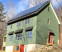
We're net positive again in 2020!
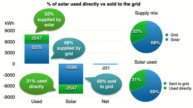
We used 7,921 kWh and generated 8,143 kWh for a net of 223 kWh for the year.
Note: I’m 11 months behind in finishing this update. Back dating the post to January 4 when I started it.
It was very close. After 2 years of missing our target by roughly 100 kWh, it feels good to be back in positive territory.
This was the first year of Covid so I was interested to see if there were any pattern shifts. You could say I’ve been exercising a hybrid work style ever since we moved out of the city. Some years I worked in the office more, others less. Jill continued to work at an office till a few years ago.
So were there any noticeable changes? Maybe a slight uptick in stove/oven usage. I do recall Jill doing a bit more baking as did the nation which is how we had a flour shortage. And the refrigerator usage was up a bit. But otherwise, no big changes.
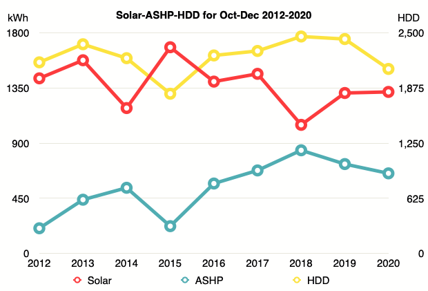
2020 was our 3rd highest energy usage year and our 6th highest solar generation year.
2020 summary: 11% warmer, 2% less usage and 2% more sun
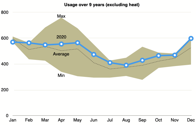
Here’s our progress for the first 9 years in the house. Yes, 9 years. You know what that means? I’m planning a 10 year house anniversary edition blog post for next year. Hopefully it won’t be 11 months late like this edition.
This will be a short edition as there were no big surprises that needed analysis.
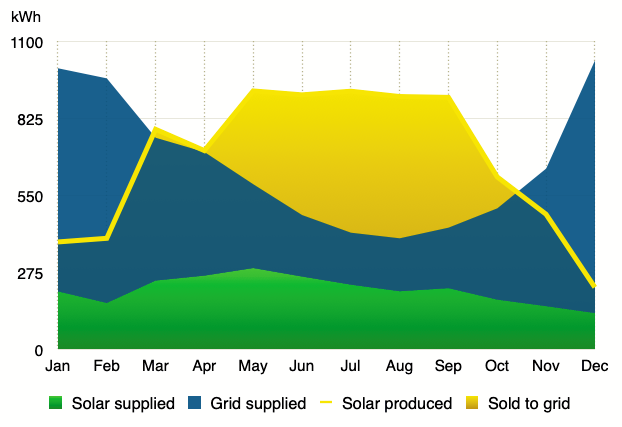
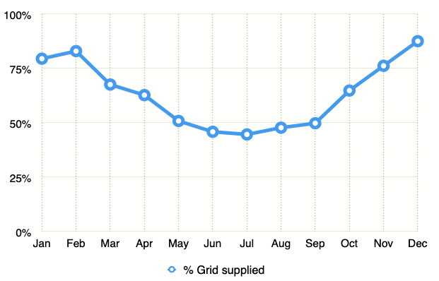
Year-over-year comparison
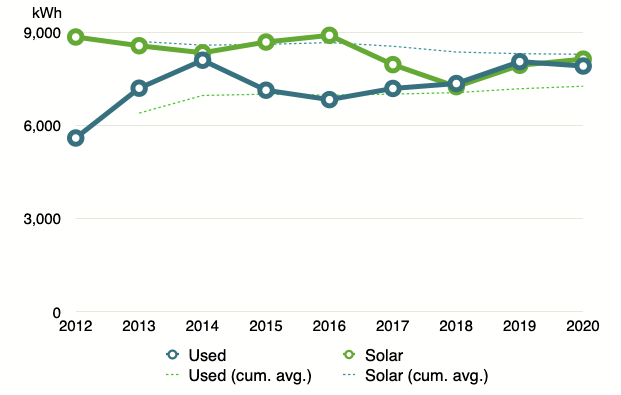
Our usage and generation have been steadily converging over the years. Although the overall trend has been up for consumption and down for generation.
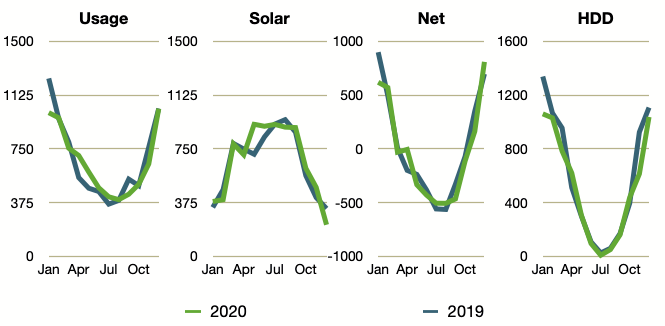
Not much change.
Again, fairly close to averages. Above average, but no extreme bounces.
Circuit-by-circuit
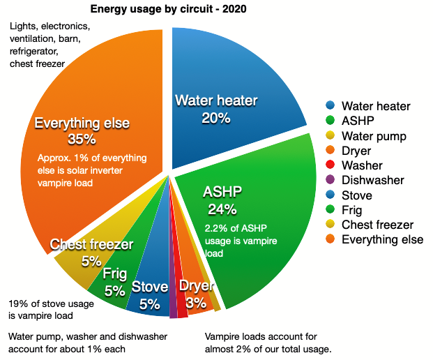
No big changes here.
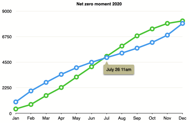
Net-zero moment
Our net zero moment in 2020 was July 26 at 11am.
Air-Source Heat Pump performance
Turned on the heat Oct 29th this year.
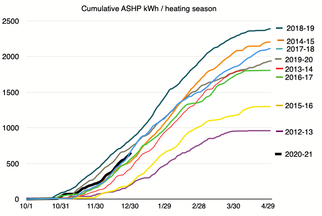
The grey line shows the 2019-2020 heating season. We ended up in the upper middle pack. And for the start of the 2020-2021 heating season we seem to be staying in the same general area.
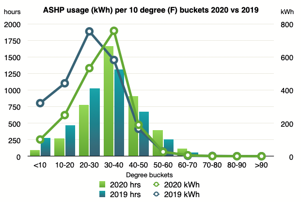
You can see the right shift with generally less super cold temperatures this season.
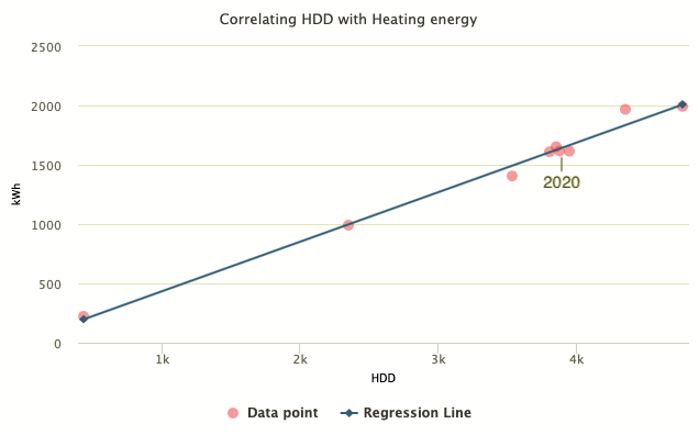
Middle of the pack again in 2020. The heat pump seems to be working fine.
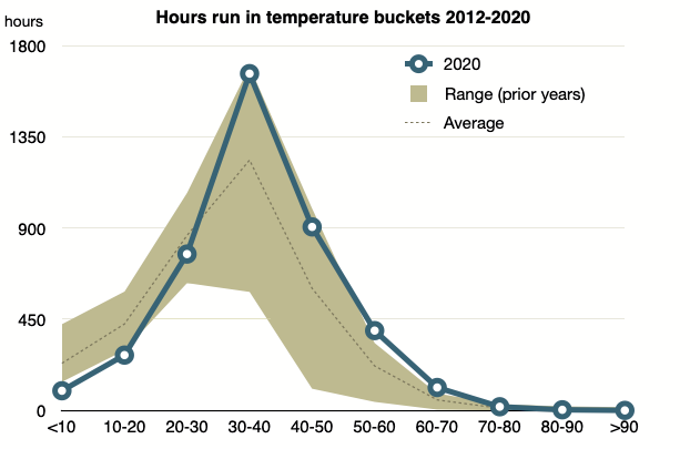
Temperatures
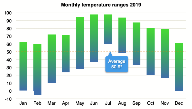
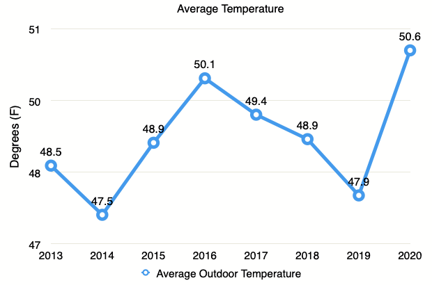
The average temperature was 50.6, the highest since we started measuring outdoor temperature, and certainly the biggest change we’ve witnessed. It will be interesting to see if next year is higher of lower.
Water
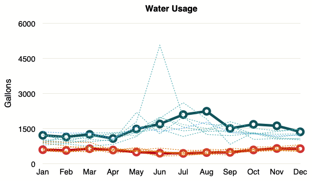
Nothing exciting here either.
Hope you enjoyed this (much late) edition of the yearly Up Hill House Energy Report.
Happy 2021!
Categories
- Air sealing 13
- Appliances & Fixtures 4
- Art 3
- Award 4
- Bathroom 8
- Batteries 1
- Decor 5
- Design 10
- Electrical 5
- Energy Calculations 13
- Energy Monitors 4
- Farm 1
- Finance 1
- Flooring 3
- Foundation 9
- Framing 8
- Heating 9
- House 7
- Insulation 8
- Kitchen 6
- Landscaping 3
- Lessons Learned 1
- Performance 60
- Plumbing 10
- Porch 5
- Radon 1
- Rainwater catchment 3
- Research / study 1
- Roof 7
- Septic / Waste water 2
- Sheetrock 6
- Siding 9
- Site Work 22
- Smart home 1
- Solar 64
- Solar Obsessed 10
- Stairs 2
- Surveying 3
- Ventilation 8
- Weather 1
- Windows & Doors 14
- plug-in 3
Archive
- Jan 2021 1
- Dec 2020 2
- May 2020 1
- Jan 2020 1
- May 2019 1
- Jan 2019 3
- Sep 2018 2
- Aug 2018 2
- Jan 2018 1
- Oct 2017 2
- Apr 2017 1
- Jan 2017 1
- Oct 2016 2
- Aug 2016 1
- Apr 2016 2
- Jan 2016 2
- Nov 2015 2
- Oct 2015 1
- Jul 2015 1
- May 2015 1
- Apr 2015 1
- Jan 2015 1
- Dec 2014 1
- Nov 2014 2
- Oct 2014 4
- Sep 2014 2
- Aug 2014 1
- Jul 2014 1
- Mar 2014 3
- Feb 2014 2
- Jan 2014 2
- Nov 2013 1
- Oct 2013 1
- Sep 2013 1
- Jul 2013 3
- Apr 2013 3
- Jan 2013 3
- Dec 2012 2
- Nov 2012 3
- Oct 2012 1
- Sep 2012 3
- Aug 2012 3
- Jul 2012 2
- Jun 2012 1
- May 2012 3
- Apr 2012 2
- Mar 2012 4
- Feb 2012 4
- Jan 2012 5
- Dec 2011 4
- Nov 2011 9
- Oct 2011 10
- Sep 2011 9
- Aug 2011 6
- Jul 2011 6
- Jun 2011 12
- May 2011 8
- Apr 2011 4
- Mar 2011 5
- Jan 2011 6
- Dec 2010 9
- Nov 2010 3
- Oct 2010 4
- Sep 2010 6
- Aug 2010 8
- Jul 2010 6
- Jun 2010 3
- May 2010 3
- Apr 2010 1
- Mar 2010 3
- Feb 2010 3
- Dec 2009 1
- Jun 2009 1
- May 2009 1
- Feb 2009 1
- Dec 2008 1
- Nov 2008 1
- Jun 2008 1