
March performance

March madness, the weather that is. March was freakishly warm and much sunnier than February (33% less heating degree days, 31% more sun). This partially resulted in 23% lower energy usage in March. Our daily average usage was down 28% from February. We generated a 345 kWh surplus in March, the first since we moved in Jan 1st.
| All values in kWh (except HDD) | Jan 2012 1 | Feb 2012 2 | Mar 2012 6 | Apr 2012 |
|---|---|---|---|---|
| Solar PV generation | 369 | 597 | 860 | -- |
| Usage | 873 | 666 | 515 | -- |
| Net usage or (generation) | 504 | 69 | (345) | -- |
| Average daily usage | 28 | 23 | 17 | -- |
| HDD (base temp 68F) 3 | 1,212 4 | 1,045 5 | 704 5 | -- |
The chart at the top of the page illustrates our actual performance for the first three months of the year, and our projected performance for the rest of the year based on estimated output of our array and historical heating degree days for the last 10 years. The usage numbers are a complete guestimate, but based on these numbers we could be net positive at the end of the year by 242 kWh. In any case, it will be interesting to track actual values against the projected values.
We’re also happy to report the TED folks accepted our return last month without incident and we’re enjoying our new eMonitor circuit level monitoring. Although we don’t have a full month of data for March, we are able to share the 15 days of data we did collect. It is available at netplusdesign.com. You can now view solar, usage, net usage, temperatures and HDD for all of February and circuit-level data for 15 days in March. We’ve included a few snapshots below.
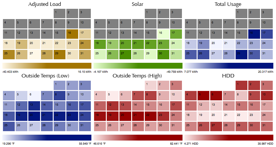
The composite image shows all the high-level data heat maps. You can see very easily that the third week was warmest and sunniest days of the month that we collected data.
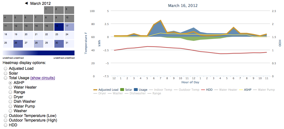
The above snapshot shows March 16, the first day we started collecting circuit-level data. It wasn’t a particularly cold day, temps were in the mis 40’s, but there was very little sun as evidenced by the relatively flat solar curve. This required the heat pump to kick in enough to make it the most active out of the recorded days. This is a bit misleading because if you compare March to February, power use that day was quite low. Now that we have multi-month data, we’ll have to find a better way to compare across months.
If you have any questions or spot any math errors drop us a note in the comments.

Categories
- Air sealing 13
- Appliances & Fixtures 4
- Art 3
- Award 4
- Bathroom 8
- Batteries 1
- Decor 5
- Design 10
- Electrical 5
- Energy Calculations 13
- Energy Monitors 4
- Farm 1
- Finance 1
- Flooring 3
- Foundation 9
- Framing 8
- Heating 9
- House 7
- Insulation 8
- Kitchen 6
- Landscaping 3
- Lessons Learned 1
- Performance 60
- Plumbing 10
- Porch 5
- Radon 1
- Rainwater catchment 3
- Research / study 1
- Roof 7
- Septic / Waste water 2
- Sheetrock 6
- Siding 9
- Site Work 22
- Smart home 1
- Solar 64
- Solar Obsessed 10
- Stairs 2
- Surveying 3
- Ventilation 8
- Weather 1
- Windows & Doors 14
- plug-in 3
Archive
- Jan 2021 1
- Dec 2020 2
- May 2020 1
- Jan 2020 1
- May 2019 1
- Jan 2019 3
- Sep 2018 2
- Aug 2018 2
- Jan 2018 1
- Oct 2017 2
- Apr 2017 1
- Jan 2017 1
- Oct 2016 2
- Aug 2016 1
- Apr 2016 2
- Jan 2016 2
- Nov 2015 2
- Oct 2015 1
- Jul 2015 1
- May 2015 1
- Apr 2015 1
- Jan 2015 1
- Dec 2014 1
- Nov 2014 2
- Oct 2014 4
- Sep 2014 2
- Aug 2014 1
- Jul 2014 1
- Mar 2014 3
- Feb 2014 2
- Jan 2014 2
- Nov 2013 1
- Oct 2013 1
- Sep 2013 1
- Jul 2013 3
- Apr 2013 3
- Jan 2013 3
- Dec 2012 2
- Nov 2012 3
- Oct 2012 1
- Sep 2012 3
- Aug 2012 3
- Jul 2012 2
- Jun 2012 1
- May 2012 3
- Apr 2012 2
- Mar 2012 4
- Feb 2012 4
- Jan 2012 5
- Dec 2011 4
- Nov 2011 9
- Oct 2011 10
- Sep 2011 9
- Aug 2011 6
- Jul 2011 6
- Jun 2011 12
- May 2011 8
- Apr 2011 4
- Mar 2011 5
- Jan 2011 6
- Dec 2010 9
- Nov 2010 3
- Oct 2010 4
- Sep 2010 6
- Aug 2010 8
- Jul 2010 6
- Jun 2010 3
- May 2010 3
- Apr 2010 1
- Mar 2010 3
- Feb 2010 3
- Dec 2009 1
- Jun 2009 1
- May 2009 1
- Feb 2009 1
- Dec 2008 1
- Nov 2008 1
- Jun 2008 1