
Visualizing home performance data
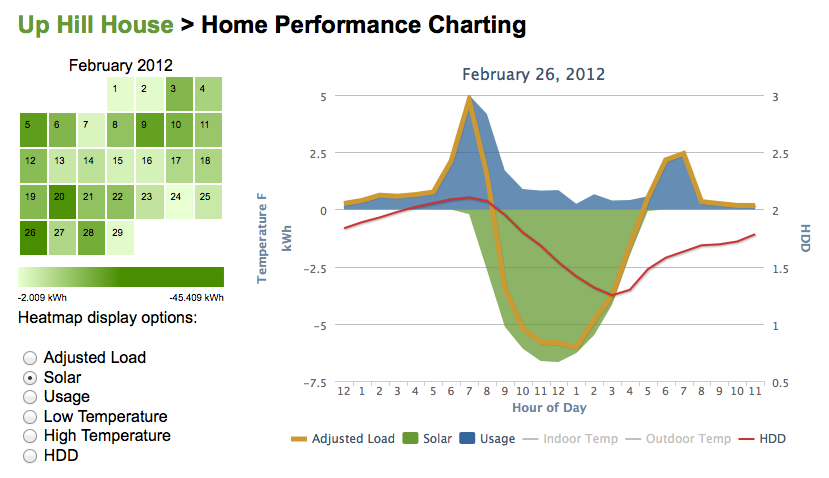
Seeing a month of home performance data isn’t easy. If you’re looking for patterns it’s like looking for a needle in a haystack.
Hourly data becomes too dense at more than a day. Day data is also a bit dense when viewing a month. Viewing usage, solar, net, indoor and outdoor temperatures all on the same chart also becomes too dense.
I decided to try a few different methods to visualize a month of home performance data. My main desire was to find the coldest days, or the days with the most sun, or the days of highest usage. The calendar heat map does a good job helping me find the answers to those questions. I can choose different data series, and click on a day to view the hourly data in the line chart. You can also click on the chart legend to hide or show a series of data.
I’d like to take the heat map a step farther and combine questions. What were the coldest days with the smallest total usage? I’d also like to narrow the time ranges within a day. What hours do we tend to use the most energy? I’d like to plot the same time frame for multiple days to compare performance. Since we now can track our major appliances, I’d like to chart those for comparison over time.
In the meantime, if you’d like to take a peek at the first prototype, I’ve uploaded it to netplusdesign.com. Please note, I’m not a developer, so it is guaranteed not to work on all browsers. I’ve only tested it on the latest versions of Safari and Firefox on the Mac, and the iPhone 4S and iPad 2. Tell me what you think in the comments.
Categories
- Air sealing 13
- Appliances & Fixtures 4
- Art 3
- Award 4
- Bathroom 8
- Batteries 1
- Decor 5
- Design 10
- Electrical 5
- Energy Calculations 13
- Energy Monitors 4
- Farm 1
- Finance 1
- Flooring 3
- Foundation 9
- Framing 8
- Heating 9
- House 7
- Insulation 8
- Kitchen 6
- Landscaping 3
- Lessons Learned 1
- Performance 60
- Plumbing 10
- Porch 5
- Radon 1
- Rainwater catchment 3
- Research / study 1
- Roof 7
- Septic / Waste water 2
- Sheetrock 6
- Siding 9
- Site Work 22
- Smart home 1
- Solar 64
- Solar Obsessed 10
- Stairs 2
- Surveying 3
- Ventilation 8
- Weather 1
- Windows & Doors 14
- plug-in 3
Archive
- Jan 2021 1
- Dec 2020 2
- May 2020 1
- Jan 2020 1
- May 2019 1
- Jan 2019 3
- Sep 2018 2
- Aug 2018 2
- Jan 2018 1
- Oct 2017 2
- Apr 2017 1
- Jan 2017 1
- Oct 2016 2
- Aug 2016 1
- Apr 2016 2
- Jan 2016 2
- Nov 2015 2
- Oct 2015 1
- Jul 2015 1
- May 2015 1
- Apr 2015 1
- Jan 2015 1
- Dec 2014 1
- Nov 2014 2
- Oct 2014 4
- Sep 2014 2
- Aug 2014 1
- Jul 2014 1
- Mar 2014 3
- Feb 2014 2
- Jan 2014 2
- Nov 2013 1
- Oct 2013 1
- Sep 2013 1
- Jul 2013 3
- Apr 2013 3
- Jan 2013 3
- Dec 2012 2
- Nov 2012 3
- Oct 2012 1
- Sep 2012 3
- Aug 2012 3
- Jul 2012 2
- Jun 2012 1
- May 2012 3
- Apr 2012 2
- Mar 2012 4
- Feb 2012 4
- Jan 2012 5
- Dec 2011 4
- Nov 2011 9
- Oct 2011 10
- Sep 2011 9
- Aug 2011 6
- Jul 2011 6
- Jun 2011 12
- May 2011 8
- Apr 2011 4
- Mar 2011 5
- Jan 2011 6
- Dec 2010 9
- Nov 2010 3
- Oct 2010 4
- Sep 2010 6
- Aug 2010 8
- Jul 2010 6
- Jun 2010 3
- May 2010 3
- Apr 2010 1
- Mar 2010 3
- Feb 2010 3
- Dec 2009 1
- Jun 2009 1
- May 2009 1
- Feb 2009 1
- Dec 2008 1
- Nov 2008 1
- Jun 2008 1