We're NOT net positive in 2019! What happened?
Year summary: We used 8,062 kWh and generated 7,945 kWh for a net of -117 kWh for the year.
Note: I’m 6 months behind in finishing this update. Back dating the post to January 4 when I statrted it.
Last year we had relatively normal usage and rather low solar production. This year we have slightly less than normal solar, but higher usage. The end result is our second net overage in the lifetime of the house.
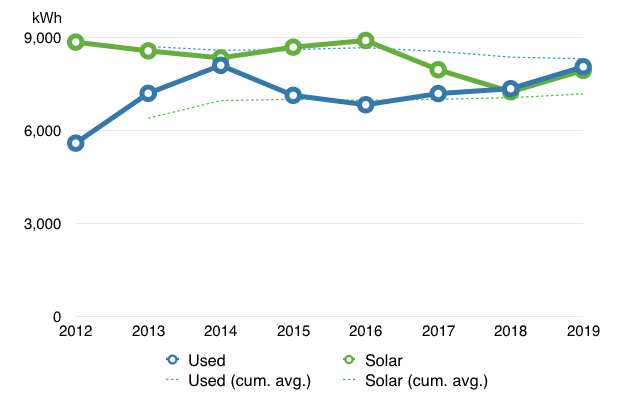
We produced 5% less solar than average, and used 14% more than average. That tipped the scales once again, just enough to push us into the negative zone. On the long view however, we’ve still generated a surplus of 9,040 kWh over the last 8 years since the house was built.
We were performing fairly normally until September. Let’s break down the numbers.
Q4 2019 summary: 1% colder, 1% more usage and 25% more sun as compared to Q4 2018.
In Q4 our total usage was 2,288 kWh, a 1% increase from our 2,264 kWh in 2018. We also generated 260 kWh more solar. Q4 2018 was a particularly low solar generation period.
October through December was also the coldest forth quarter since we started recording temperature data at the house.
Overall, here’s how this quarter and the year compare.
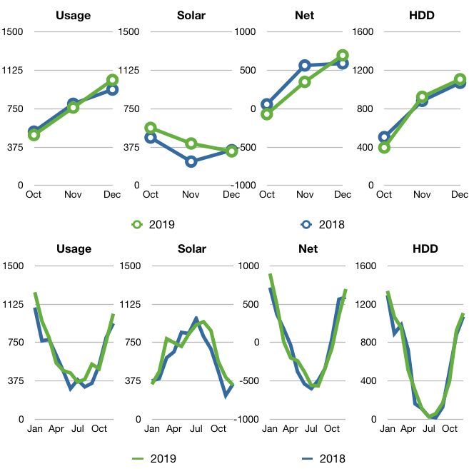
Year-over-year comparison
Here’s our progress for the first 8 years in the house.
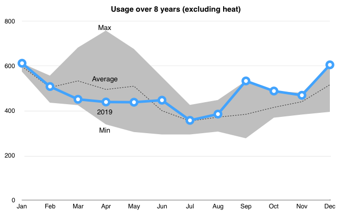
We were at the maximum range September-December. September was the farthest off from average. I’m going to have to build some better comparison charts to find the largest increased usage.
Circuit-by-circuit
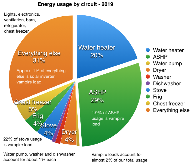
2019 was our second coldest year in the house, although we continue to see wide extremes in temperature ranges (see temperature ranges below). The ASHP used 29% of the total as opposed to 32% last year. Vampire loads decreased slightly this year. We cooked 1% less in 2019 as the induction cooktop & stove vampire loads increased in comparison to use. The combined vampire load for the stove, ASHP and solar inverter was 141 kWh in 2019, about 11 kWh more than last year.
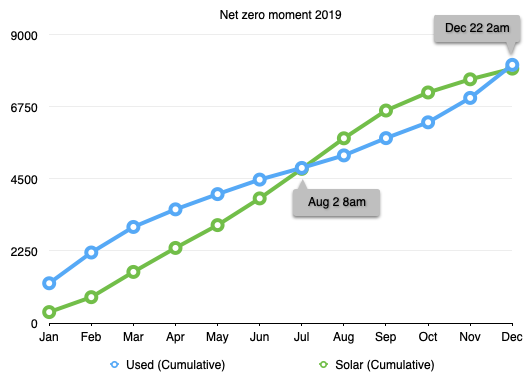
Net-zero moment(s)
Our first ‘net zero moment’ this year occurred on August 2nd at 8am. Then sadly, on Dec 22 at 2am, our curves reversed again. Just 9 days short of hitting out net zero goal for the year.
We had 21 days this year where the solar panels generated less than 1 kWh, mainly because they were covered in snow. We had 31 days in 2018, 23 days in 2017 and 13 days in 2016.
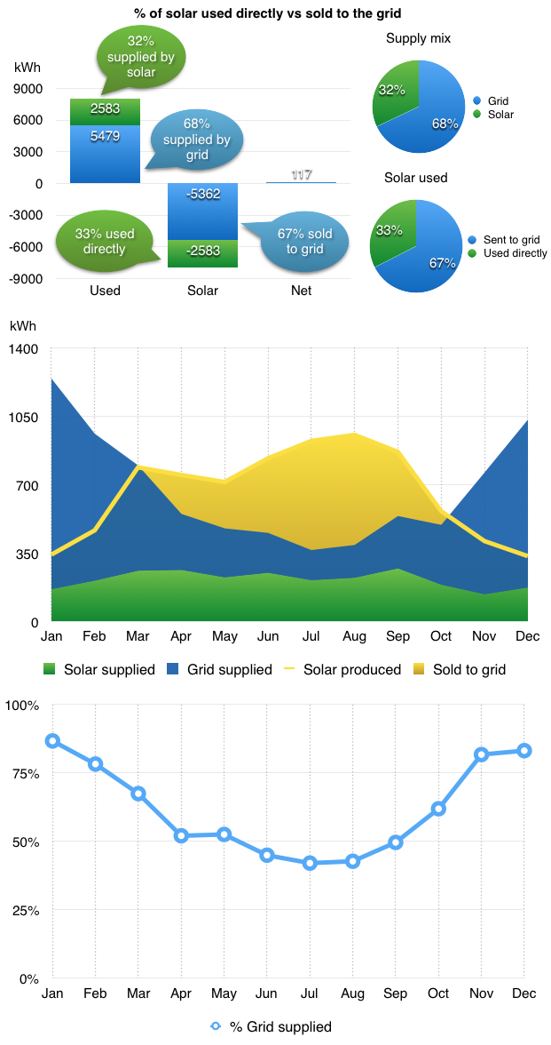
Where did all that solar go?
Of the 7,945 kWh we generated in 2019, we only used used 32% ourselves. The other 68% we sold back to the grid at a greatly reduced price. We’ve tried various strategies to consume energy when the sun is shining, but the largest energy consumers, hot water and heat, don’t amend themselves easily to this type of use.
I track our net energy use by the calendar year since we moved in Jan 1, 2012. But the electric company tracks our yearly solar anniversary in June. Although we didn’t net out Jan to Jan, we did still produce more power June to June. This year we sold roughly 734 kWh back to the grid and earned $25.74, about $0.035/kWh from the power company.
National Grid does not tell us how much electricity would cost if we bought it from them. They only do that if you actually use more electricity than you generate. So I have to go to the NYSEDA website to find the state averages. Using their data, we would have paid about $10,555 over the past 8 years for the 57,510 kWh we’ve used if we didn’t have solar. Our solar cost $14,320 to purchase in 2011. In very simple terms that puts us at about 74% payback. At our current rate of use and the trending price of power, it will take us another 3 years to break even in simple terms.
Air-Source Heat Pump performance
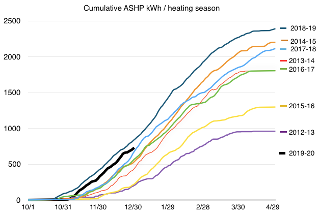
The 2018-19 heating season (dark blue line) turnded out to be highest usage of our ASHP since we built the house. Look at the difference between the 2012-13 season, our first and lowest) versus 2018-19. We started early with some unusual cold snaps. We used 2,328 kWh for heat in 2019. At the average electricity price this year, $0.18/kWh, that would be about $419. With 6,969 HDD in 2019, that is $0.060/HDD.
Now the thick black curve showing the start of the 2019-20 season is shaping up to be second only to last year. We turned on the heat November 5th, later than last year. Since we are a passive solar house I also wanted to look at how sunny it was this last quarter so I pulled together a chart showing solar (proxy for solar heat gain, except when covered by snow), heating degree days (HDD) and ASHP energy usage.
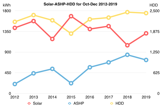
In general, despite the HDD days being only slightly lower than last year, we required a little less heat due to the increased solar gain.
The divergence of the HDD and solar lines in 2019, is only slightly larger than 2014. In general, the higher the HDD the more heat required, but solar heat gain can lower our heat energy requirement as it did in 2012, 13, 16 and 17.
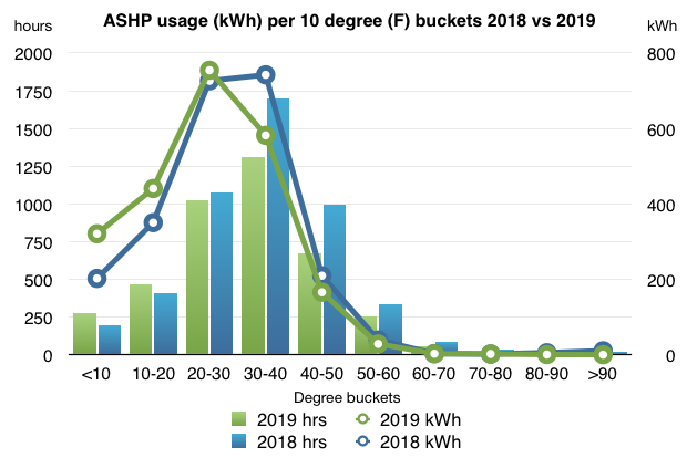
Last year I started showing our ASHP usage broken down by temperature buckets. The chart below shows 2019 in comparison to 2018. We had a lot more usage in the lower temperature ranges, with less in the higher ranges.
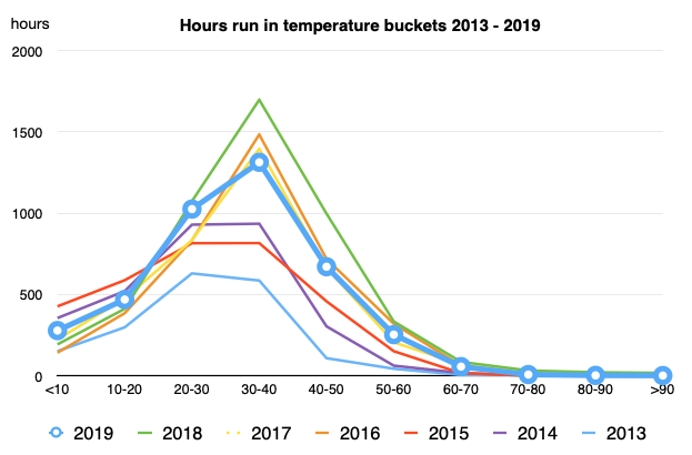
When we compare all the hours the ASHP has operated each year by 10 degree buckets we see that we were running about average in the <10 and 10-20 ranges. High for the 20-30 degree range and higher than average for 30-40, 40-50 and 50-60 degree ranges.
The following chart tells me the ASHP was working a little less efficiently than the previous 7 years. This chart plots HDD vs kWh used over the last 7 years, using yearly data. Will have to keep an eye on it.
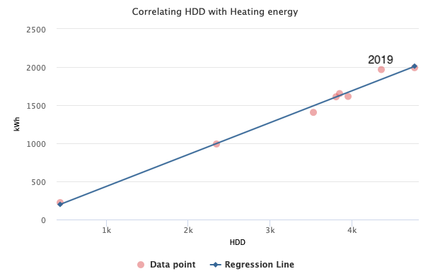
The highest value on the upper right, is 2018.
Temperatures
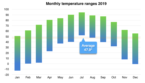
We experienced our 5th largest temperature range out of the last 8 years, 106.1°. Our coldest temperature was -11.8° on January 22 at 6am. Our high was 94.3° on July 30 at 12pm.
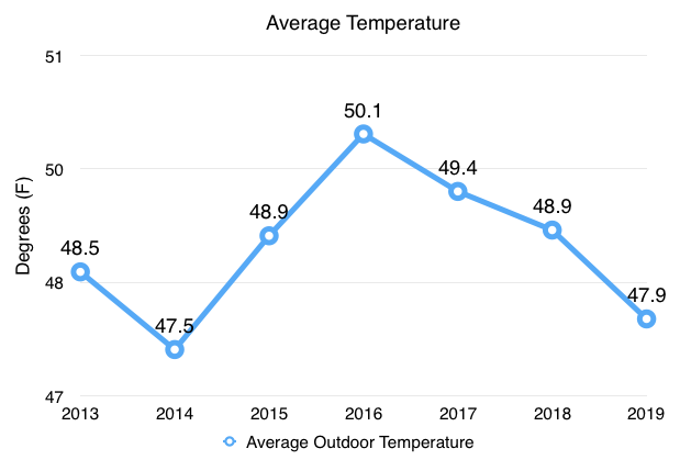
The average temperature for 2019 was 47.9°, our second lowest average temperature. 2014 was the lowest average temperature at 47.5°.
Water
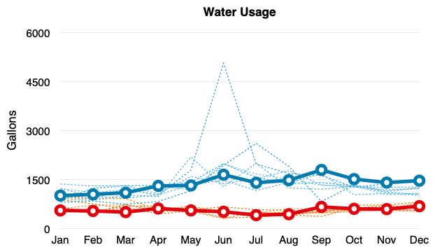
We have been fairly consistent in our hot water usage. Over the year we averaged 18.1 gal/day. That hot water requires 244 watts/gallon to heat. We used a total 23,002 gallons of water in 2019, 63.0 gal/day, as compared to 21,725 gallons of water in 2018 and 22.406 gallons in 2017. It took 61 kWh to pump that water out of the ground. Our water pump used about 2.6 Wh/gal this year. It was about that same as last year versus 3.1 Wh/gal in 2017. Pump is doing well. :-)
Hope everyone had an awesome 2019, because 2020 will be very different.
Categories
- Air sealing 13
- Appliances & Fixtures 4
- Art 3
- Award 4
- Bathroom 8
- Batteries 1
- Decor 5
- Design 10
- Electrical 5
- Energy Calculations 13
- Energy Monitors 4
- Farm 1
- Finance 1
- Flooring 3
- Foundation 9
- Framing 8
- Heating 9
- House 7
- Insulation 8
- Kitchen 6
- Landscaping 3
- Lessons Learned 1
- Performance 60
- Plumbing 10
- Porch 5
- Radon 1
- Rainwater catchment 3
- Research / study 1
- Roof 7
- Septic / Waste water 2
- Sheetrock 6
- Siding 9
- Site Work 22
- Smart home 1
- Solar 64
- Solar Obsessed 10
- Stairs 2
- Surveying 3
- Ventilation 8
- Weather 1
- Windows & Doors 14
- plug-in 3
Archive
- Jan 2021 1
- Dec 2020 2
- May 2020 1
- Jan 2020 1
- May 2019 1
- Jan 2019 3
- Sep 2018 2
- Aug 2018 2
- Jan 2018 1
- Oct 2017 2
- Apr 2017 1
- Jan 2017 1
- Oct 2016 2
- Aug 2016 1
- Apr 2016 2
- Jan 2016 2
- Nov 2015 2
- Oct 2015 1
- Jul 2015 1
- May 2015 1
- Apr 2015 1
- Jan 2015 1
- Dec 2014 1
- Nov 2014 2
- Oct 2014 4
- Sep 2014 2
- Aug 2014 1
- Jul 2014 1
- Mar 2014 3
- Feb 2014 2
- Jan 2014 2
- Nov 2013 1
- Oct 2013 1
- Sep 2013 1
- Jul 2013 3
- Apr 2013 3
- Jan 2013 3
- Dec 2012 2
- Nov 2012 3
- Oct 2012 1
- Sep 2012 3
- Aug 2012 3
- Jul 2012 2
- Jun 2012 1
- May 2012 3
- Apr 2012 2
- Mar 2012 4
- Feb 2012 4
- Jan 2012 5
- Dec 2011 4
- Nov 2011 9
- Oct 2011 10
- Sep 2011 9
- Aug 2011 6
- Jul 2011 6
- Jun 2011 12
- May 2011 8
- Apr 2011 4
- Mar 2011 5
- Jan 2011 6
- Dec 2010 9
- Nov 2010 3
- Oct 2010 4
- Sep 2010 6
- Aug 2010 8
- Jul 2010 6
- Jun 2010 3
- May 2010 3
- Apr 2010 1
- Mar 2010 3
- Feb 2010 3
- Dec 2009 1
- Jun 2009 1
- May 2009 1
- Feb 2009 1
- Dec 2008 1
- Nov 2008 1
- Jun 2008 1